Last updated on June 7th, 2022 at 08:47 am
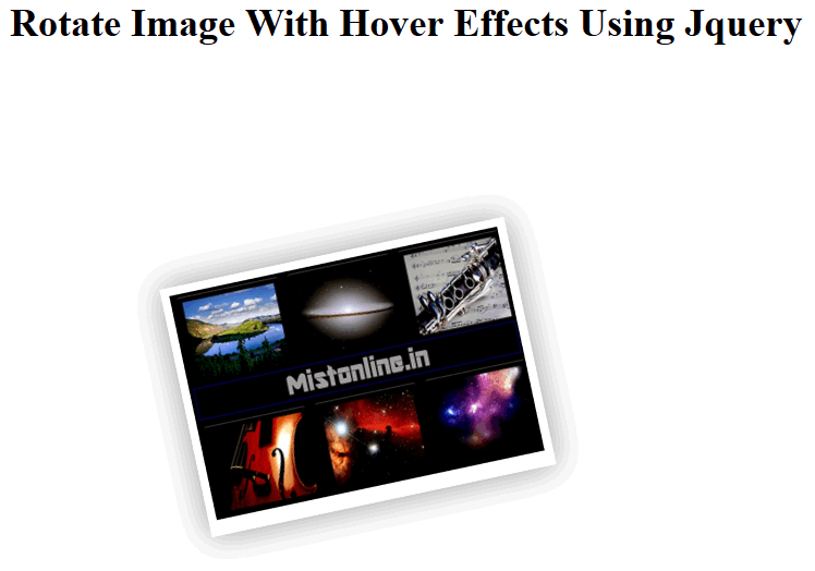
Image displayed will get randomly tilted to different angles defined in an array either towards right or left. While mouse hover(Move mouse over the top of image) it will zoom within the defined range using CSS. Here I am zooming it to scale(2.1). Image will also have shadow effect added using CSS.
You Might Also Be Interested In Similar Scripts Below
Jquery Image Gallery
Zoom / Scale Web Page Using Jquery
Zoom In and Out Image Using Jquery
Let us start by discussing above the Jquery code defined.
$("a.polaroid").each(function() {
	var num = ['15','12','-3','9','-9'];
var rnum = Math.floor(Math.random()*num.length);
$(this).css({
"-webkit-transform": 'rotate(' + (Math.floor(Math.random()*10)-num[rnum]) + 'deg)',
"-moz-transform": 'rotate(' + (Math.floor(Math.random()*10)-num[rnum]) + 'deg)',
})
.hover(function() {
$(this).css({
"-webkit-transform": 'rotate(' + (Math.floor(Math.random()*10)-5) + 'deg) scale(1.05)',
"-moz-transform": 'rotate(' + (Math.floor(Math.random()*10)-5) + 'deg) scale(1.05)',
"transform": 'scale(2.1)',
"position": 'top'
})
}, function() {
$(this).css({
"-webkit-transform": 'rotate(' + (Math.floor(Math.random()*10)-num[rnum]) + 'deg)',
"-moz-transform": 'rotate(' + (Math.floor(Math.random()*10)-num[rnum]) + 'deg)',
})
});
Here you can see that we have defined an array
var num = ['15','12','-3','9','-9'];
var rnum = Math.floor(Math.random()*num.length);
Negative numbers will rotate image towards right and positive numbers will rotate image towards left.
All we are doing here is randomly displaying array values.
The next part is
$(this).css({
"-webkit-transform": 'rotate(' + (Math.floor(Math.random()*10)-num[rnum]) + 'deg)',
"-moz-transform": 'rotate(' + (Math.floor(Math.random()*10)-num[rnum]) + 'deg)',
})
.hover(function() {
$(this).css({
"-webkit-transform": 'rotate(' + (Math.floor(Math.random()*10)-5) + 'deg) scale(1.05)',
"-moz-transform": 'rotate(' + (Math.floor(Math.random()*10)-5) + 'deg) scale(1.05)',
"transform": 'scale(2.1)',
You can see the rotate value in Degrees assigned to -webkit-tranform and -moz-transform. Then I am adding a scale(2.1) this will basically zoom the image for us.
Let us add some CSS style with Shadow effect background for the image
 .column {
float: left; margin-right: 70px; padding: 50px;
}
.span-18 { width: 805px;margin:0 auto;}
}
.last {
margin-right: 0;
}
a.polaroid {
-moz-transition: all 0.2s ease-in-out;
-webkit-transition: all 0.2s ease-in-out;
display: block;
background: #fff;
padding: 5px;
margin:5px;
-moz-box-shadow: 0 0 20px rgba(0,0,0,0.4);
-webkit-box-shadow: 0 0 20px rgba(0,0,0,0.4);
box-shadow: 0 0 20px rgba(0,0,0,0.4);
margin-bottom:1em;
}
a.polaroid img {
width: 205px;
height: 140px;
}
a.polaroid:hover {
-moz-box-shadow: 0 0 20px rgba(0,0,0,0.4);
-webkit-box-shadow: 0 0 20px rgba(0,0,0,0.4);
box-shadow: 0 0 20px rgba(0,0,0,0.4);
}
Now the last step is the HTML part
<div class="span-6 column rotated">
<a id="image1" class="polaroid" href="" rel="" title="first image"> <img id="content" src="thumbnail.jpg" alt="image" /> </a>
</div>
Here thumbnail.jpg is the image that we need to rotate.
 admin
admin